


One of my biggest achievements was being the lead designer on the the Kansas City Art Institute Student Living Center project. Not only was I responsible for designing the exterior facade but i was able to create images and renderings that helped convey the idea to the client and our project team. The above rendering shows the intimate courtyard space that is created between the new and old Student Living Center buildings.
As we wrapped up the schematic design phase our client was not completely sold on the original design idea. I was tasked to reassess the overall facade design of the whole building. This was one of the diagrammatic image of the new design I proposed to the team. They approved and we moved forward.
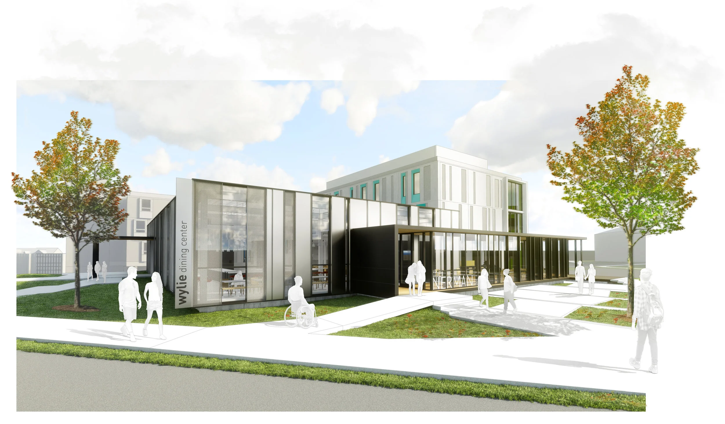
The Wylie dining center is the campus’ new dining facility that is directly attached to the Student Living Center building. I worked directly with the lead Project Architect in creating and developing the massing, facade, and choice of materials throughout the entirety of each project phase.
The Nerman Cafe is a current staple on the KCAI campus. The Nerman family wanted to expand and provide easier access for students and the community/neighborhood. The result is this sleek lower bar that extrudes from the dining mass. This lower bar provides indoor and outdoor seating as well as a direct link to the Wylie Dining Center.
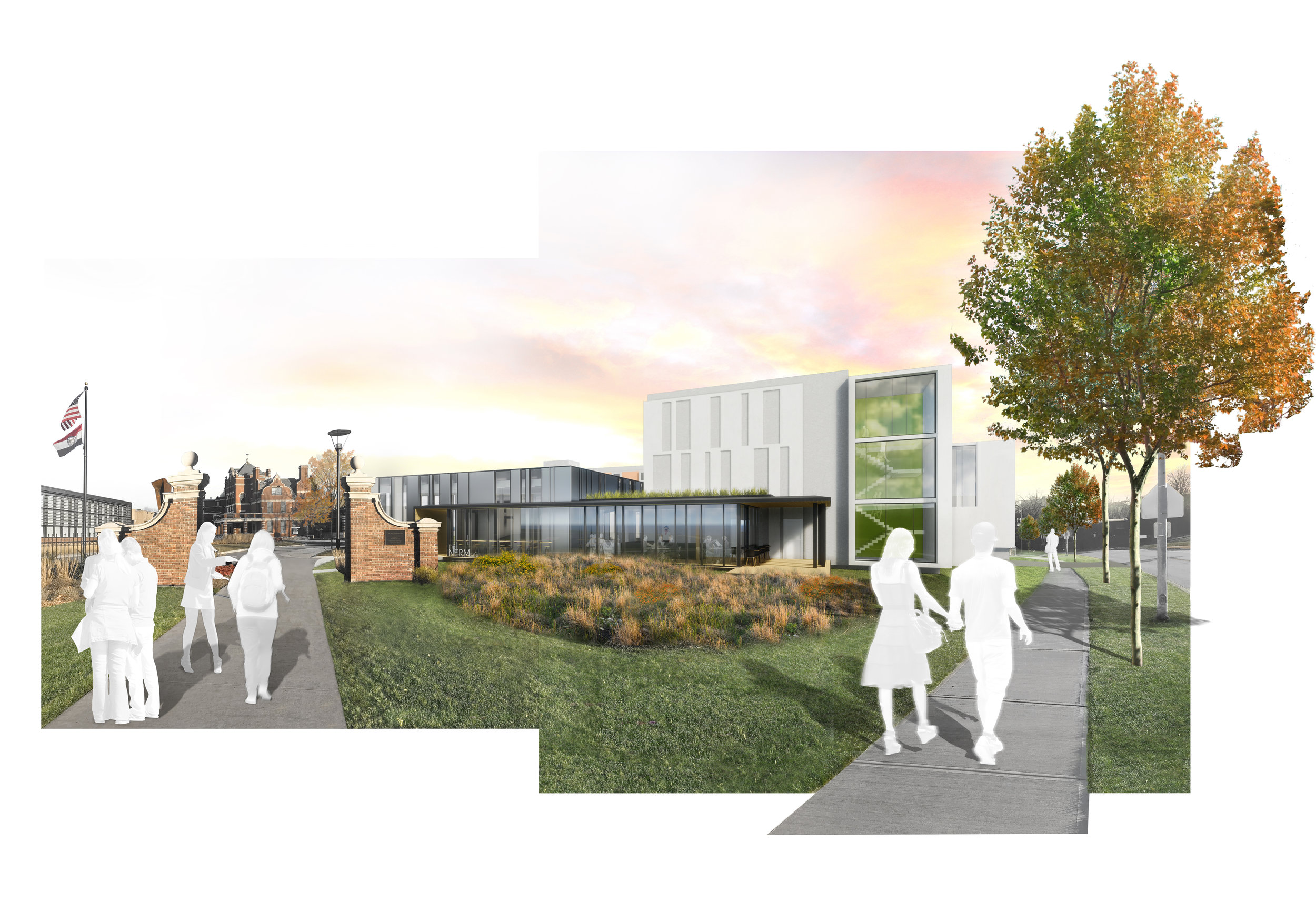
View from the North end of campus. The rendering shows the main entrance by Vanderslice hall and its pedestrian connection to Warwick Boulevard.
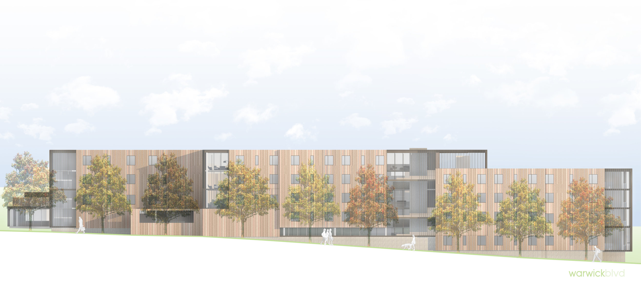
The colors surrounding the residential windows on the housing portion of building have a deeper meaning than just a spectrum of colors. Since the building will sit along a Boulevard I saw an opportunity to better blend the building with its immediate context. I was able to achieve this by picking colors based on the seasonal cycle of a tree leaf. The gradient of colors will provide a playful experience for neighbors and students as they promenade along the Boulevard. The window frame colors also act as a direct reflection of the eclectic students and the diversity of their curriculum and work. The interspace side of the building is composed of cool-blue colors that fade vertically to lighter shades. Using blue is a psychological design strategy to help soothe the students as they relax in and around the building. The lighter shades also help soften the overall mass of the building by using colors that closely resemble the sky. This should help users feel less crowded as they occupy the tight courtyard between these two heavy masses.